Think about the most common needs of students. Students probably want to easily identify what the current chapter/unit/module is. They will most likely want to be able to quickly access your contact information. And they probably want to be able to jump to critical course information - like your course syllabus. Alexandra Pickett pointed me to a study that showed "findability" for information in online courses is linked to student self-efficacy, motivation, and perception of the instructor1.
The landing page also provides a wonderful canvas for you to demonstrate your proficiency with designing the structure of the course; we'll tackle pedagogy and aesthetic a different day.
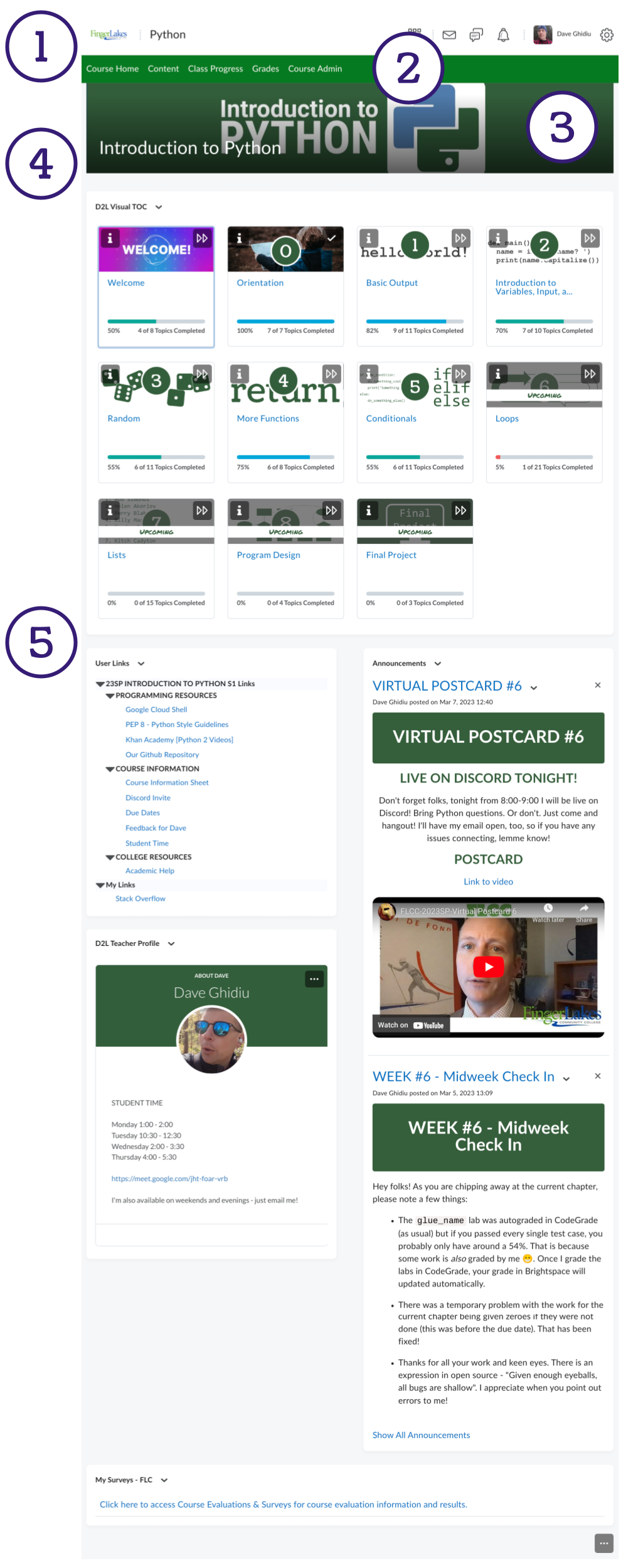
This is the first of a series of posts that will walk you through rethinking the structure of your course. We'll look at five different places to easily add clarity to your course:
- The navbar title (yes - that can be changed easily!)
- The navbar tools (intentionally adding or removing tools)
- The course banner
- The course title that overlays the banner
- The course widgets you elect to use
The image below shows a graphical representation of each of these five components. Changing each one of these is very simple - though you will have to invest some thought when curating the navbar tools and the course widgets.
Stay tuned for the series!

